Photography & Imagery

Style, Themes, Subjects
Bright, fresh, personal.
The imagery chosen for Revere Medical reflects the brand's commitment to building trust and creating a patient-centered experience. Each image represents real, everyday people and families from diverse backgrounds, fostering an approachable and relatable connection. The focus on authentic expressions — whether it's a smiling patient, a family spending time together, or a moment between a provider and patient — reinforces Revere Medical’s dedication to personalized care that is both compassionate and effective.
These visuals also align with the brand’s emphasis on community and well-being. By featuring moments of interaction, comfort, and connection, these images help convey the core values of trust, collaboration, and support that Revere Medical embodies. The style is natural and inviting, ensuring that patients feel they are not just receiving care but being truly understood and valued.
Lighting should be bright and natural, focus should be clear, and white balance / cast should be neutral. People should be front and center, whether interacting with each other or connecting with us as viewers, with natural or joyful expressions. Overall hues should align with our color palette, so images may be manipulated for cohesion. Selection for marketing pieces should favor featuring patients.
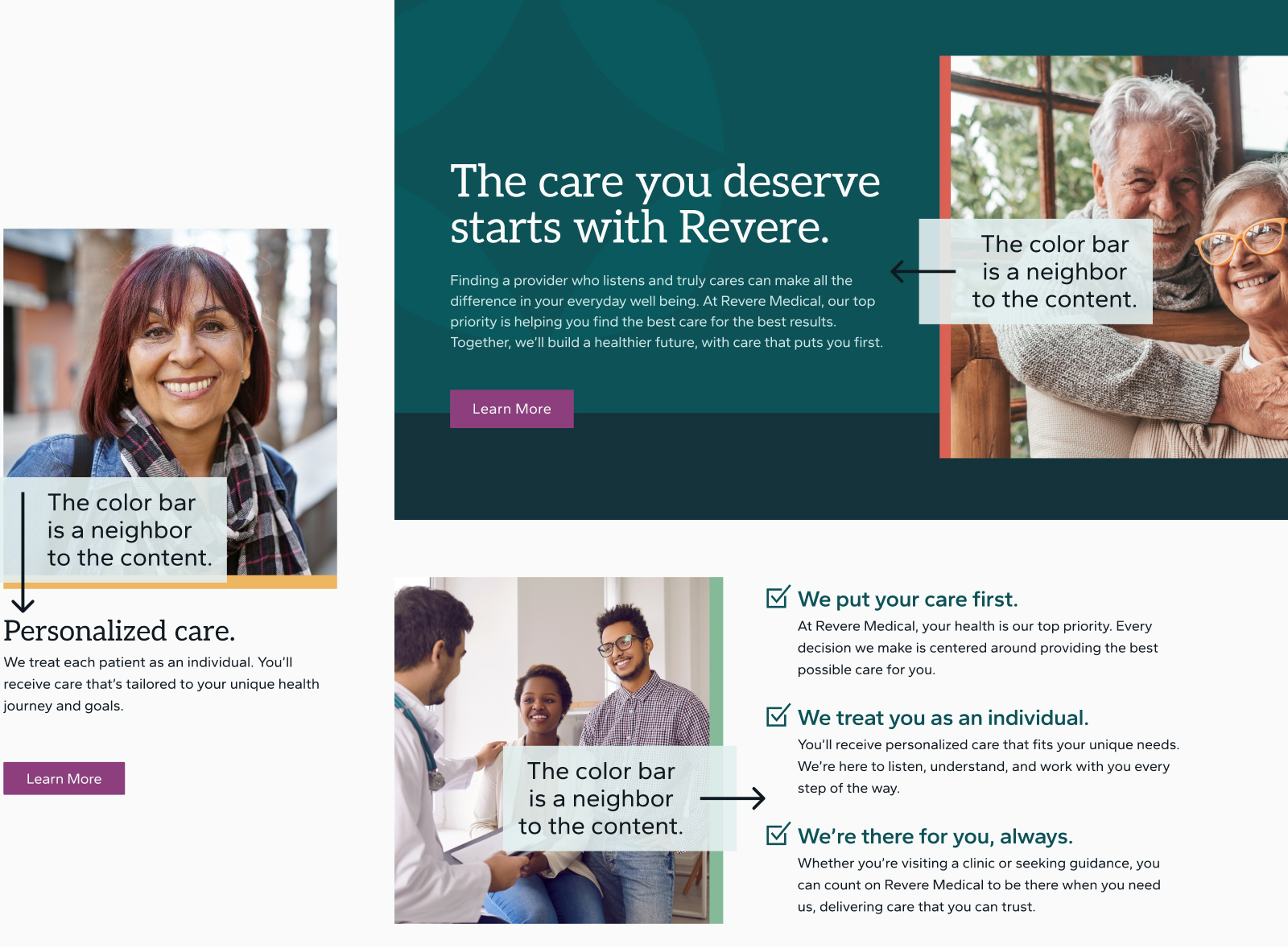
Image Treatments
Anchored for clarity and strength.
Revere Medical’s image treatment uses the Anchored Frame Technique to visually mirror our commitment to clear direction and reliable stability — just as a border creates clarity and structure for an element.
Each image is framed with a strong, solid border on one side, symbolizing the dedication patients can expect from Revere. This color bar is a “neighbor” to the content, leading the eye to continue through the layout. Straight frame edges for all images reinforce these ideas.
Our secondary color palette comes into play here, adding diversity to the primary and neutral colors. Care should be taken to apply a different secondary color to each subsequent color bar in a marketing piece so as not to feel repetitive. The color bar thickness should take up approximately 2-4% of the frame’s width or height but must be consistent throughout a single marketing piece or collection of printed materials.
