Color: Introduction
The color palette for Revere Medical strikes a balance between strength and approachability — core attributes that define the health care experience we deliver.
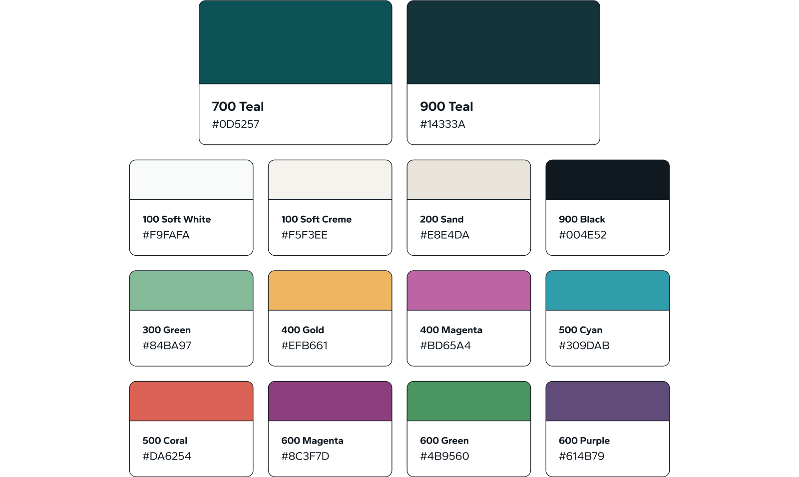
Color Overview
The primary colors, 700 Teal and 900 Teal, convey thoughts of stability, healing, and trust. They provide a calm yet bold foundation, helping patients, providers, staff, and the communities we serve feel secure and supported from their first interaction with the brand.
The neutral tones provide a clear, consistent base for the visuals that ensures a strong, cohesive brand image. By anchoring the primary colors with these neutrals, the overall palette reinforces clarity and professionalism, making every application of the brand both approachable and authoritative.
The dynamic secondary color palette brings a touch of personality, a reflection of the diversity we see in every community. These hues connect across the color wheel to add depth and energy to a cohesive palette that embodies our steadfast commitment to improving patient outcomes.
Primary Colors
The primary colors, 700 Teal and 900 Teal, convey thoughts of stability, healing, and trust. They provide a calm yet bold foundation, helping patients, providers, staff, and the communities we serve feel secure and supported from their first interaction with the brand.

Secondary Colors
The dynamic secondary color palette brings a touch of personality, a reflection of the diversity we see in every community. These hues connect across the color wheel to add depth and energy to a cohesive palette that embodies our steadfast commitment to improving patient outcomes.

Neutral Colors
The neutral tones provide a clear, consistent base for the visuals that ensures a strong, cohesive brand image. By anchoring the primary colors with these neutrals, the overall palette reinforces clarity and professionalism, making every application of the brand both approachable and authoritative.